I like visual arts, but I’m moderately colorblind and thus have never been great at making my own works. When I’m plotting data and need colors, my standard procedure is having a website generate me a color palette or finding a visually pleasing one someone else has made and posted online.
I also love film, and I started thinking about ways I could generate color palettes from films that use color beautifully. There are a number of packages that can generate color palettes from images in R, but I wanted to try writing the code myself.
I also wanted to not just generate a color palette from an image, but then swapping it with a different color palette from a different film. This is similar to neural style transfer with TensorFlow, but much simpler. I’m one of those people that likes to joke how OLS is undefeated; I generally praise the use of simpler models over more complex ones. So instead of a neural network, I use k-means clustering to transfer a color palette of one still frame from a film onto another frame from a different movie.
Here’s the code for the functions I’ll be using. I’ll describe them in more detail below.
library(imager)
library(tidyverse)

norm <- function(x) (x - min(x)) / (max(x) - min(x))

shuffle <- function(x) x[sample(seq_along(x), length(x))]

get_palette <- function(filename, k, mdn = FALSE) {

  dat_pal <- load.image(filename) %>%
    as.data.frame(wide = "c")

  res_pal <- dat_pal %>%
    select(starts_with("c")) %>%
    kmeans(k, algorithm = "Lloyd", iter.max = 500)

  if (!mdn) {
    pal <- res_pal$centers %>%
      as_tibble() %>%
      mutate(hex = rgb(c.1, c.2, c.3)) %>%
      pull(hex)
  } else if (mdn) {
    pal <- dat_pal %>%
      mutate(cluster = res_pal$cluster) %>%
      group_by(cluster) %>%
      summarise(across(starts_with("c"), median)) %>%
      mutate(hex = rgb(c.1, c.2, c.3)) %>%
      pull(hex)
  }

  return(pal)
}

make_plot <- function(filename_in, pal, xy = TRUE) {

  the_shot <- load.image(filename_in)

  dat_shot <- the_shot %>%
    as.data.frame(wide = "c")

  dat_shot_norm <- dat_shot %>%
    when(!xy ~ select(., starts_with("c")), ~ .) %>%
    mutate(across(everything(), norm))

  res_shot <- kmeans(
    dat_shot_norm,
    length(pal),
    algorithm = "Lloyd",
    iter.max = 500
  )

  dat_shot$clust <- factor(res_shot$cluster)

  p <- ggplot(dat_shot, aes(x = x, y = y)) +
    geom_raster(aes(fill = clust)) +
    scale_y_reverse() +
    theme_void() +
    theme(legend.position = "none") +
    scale_fill_manual(values = pal)

  return(list(plot = p, dims = dim(the_shot)[1:2]))
}
When I thought about transferring the color of one film onto an image from another film, two things came to mind immediately. The Umbrellas of Cherbourg is one of the most visually striking films I’ve ever watched; there’s such a dazzling variety of colors, and it displays a wide collection of unique wallpaper. As for what shot to impose those colors onto, one of my favorite shots is the “coffee scene” from Chungking Express.
The function get_palette() reads an image in using the package. This package allows you to decompose the image into a data frame, where each row is a pixel. There are x and y columns, which show where at in the image the pixel is when plotted. There are three additional columns that contain the RGB values. I k-means cluster the three RGB columns, using the built-in kmeans function and giving it an arbitrary k, and extract the average RGB values from each cluster (i.e., the cluster centers) and then convert them to hex values using the built-in rgb function.
And then make_plot() works similarly. It takes a file name, reads it in, and converts it to a data frame. This time, I allow the x and y columns to be used in the clustering. This means that clustering will be a mix of (a) what the original color was, and (b) where at in the frame the pixel is. All columns are normalized. I use the length of the color palette to determine k. I then plot it with , using the new color palette to fill-in according to the clustering of the new pixels. It’s more or less a coloring book, where the lines are determined by k-means clustering.
set.seed(1839)

pal1 <- get_palette("umbrellas.jpeg", k = 12)
plot1 <- make_plot("chungking.jpeg", pal = pal1)

ggsave(
  "chungking_k12.png",
  plot1$plot,
  width = plot1$dims[1],
  height = plot1$dims[2],
  units = "px"
)
I write the file out to the same dimensions to preserve the integrity of the aspect ratio. Here’s the two original shots, and then the one produced with make_plot():
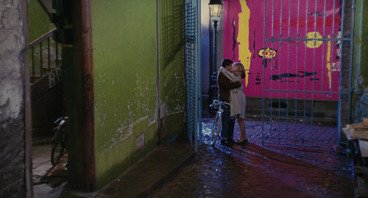
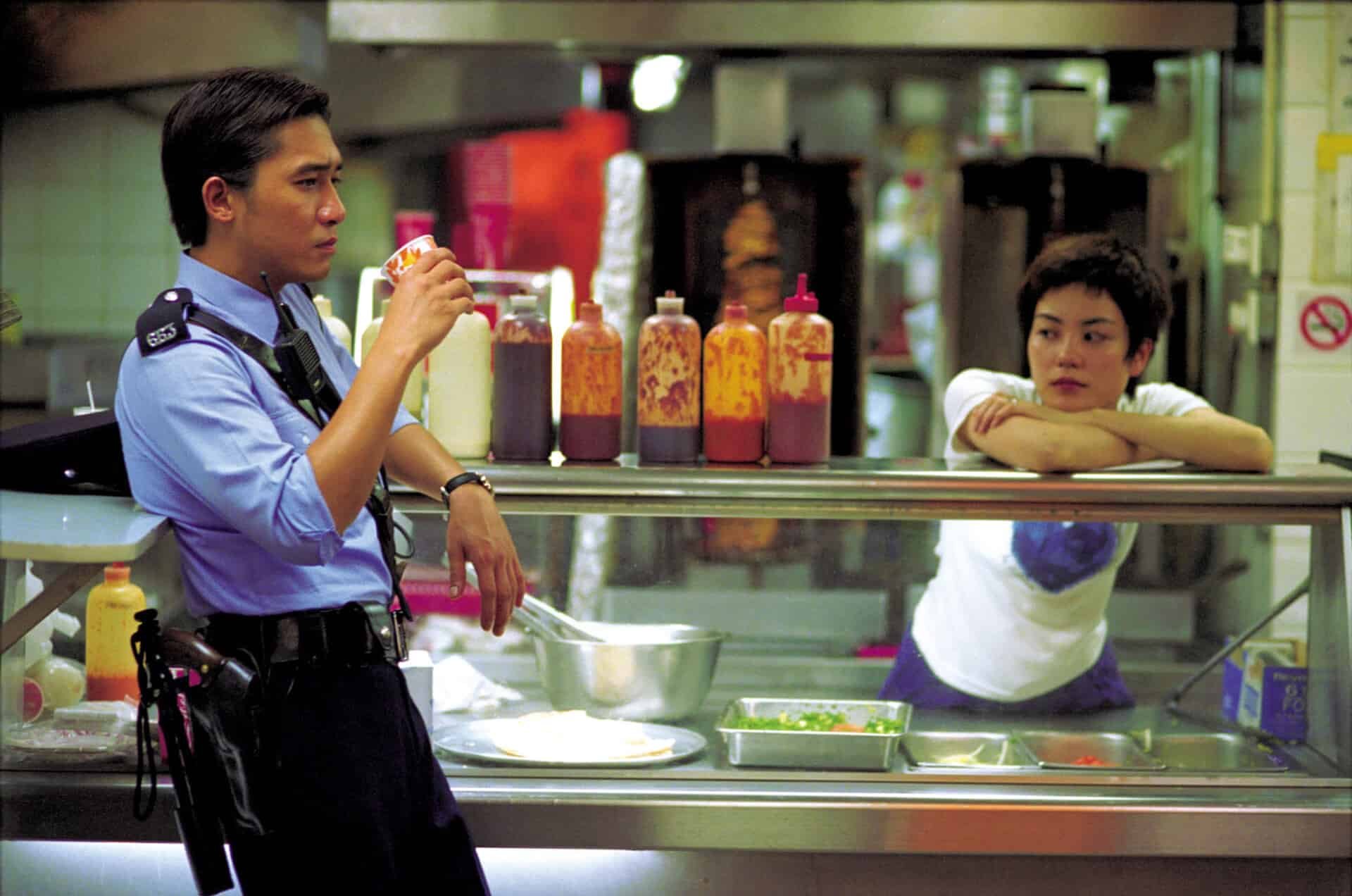
We can see that the new coloring is a blend of pixel location and the color of the original pixel.
I started playing around with other ideas, and include two new parts in this next image blend. First, I get the median value, instead of the mean, of the RGB values when clustering for the palette; and second, I shuffle up the order of the palette randomly before feeding it into the plotting function.
I wanted to apply a movie with warm colors to a movie with cool colors. My mind went to Her and Blade Runner, respectively.
set.seed(1839)

pal2 <- get_palette("her.jpeg", k = 3, mdn = TRUE)
plot2 <- make_plot("bladerunner.jpeg", pal = shuffle(pal2))

ggsave(
  "bladerunner_k3.png",
  plot2$plot,
  width = plot2$dims[1],
  height = plot2$dims[2],
  units = "px"
)
The originals:


And the blend:
What I like about this is that, since we include x and y in the clustering of the second image, we get different colors on either side of Roy Batty’s face.
I also wanted to see what the influence of taking out the x and y values would be. xy = FALSE removes any influence of where the pixel is placed in the image, so clustering is done purely on RGB values.
set.seed(1839)

pal3 <- get_palette("2001.jpeg", k = 5, mdn = TRUE)
plot3 <- make_plot("arrival.jpeg", pal = shuffle(pal3), xy = FALSE)

ggsave(
  "arrival_k5.png",
  plot3$plot,
  width = plot3$dims[1],
  height = plot3$dims[2],
  units = "px"
)
I wanted to combine these two shots from 2001: A Space Odyssey and Arrival because they visually rhyme with one another:
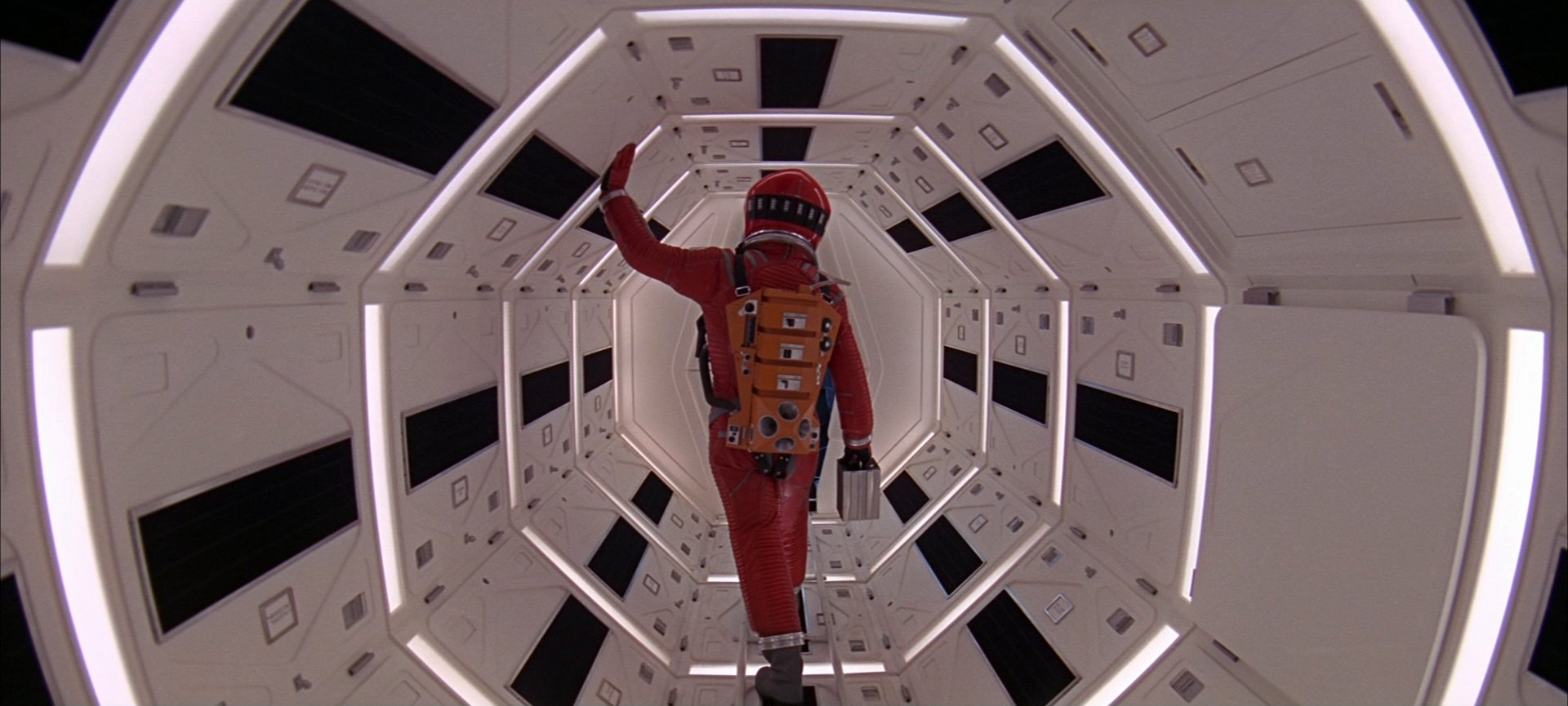
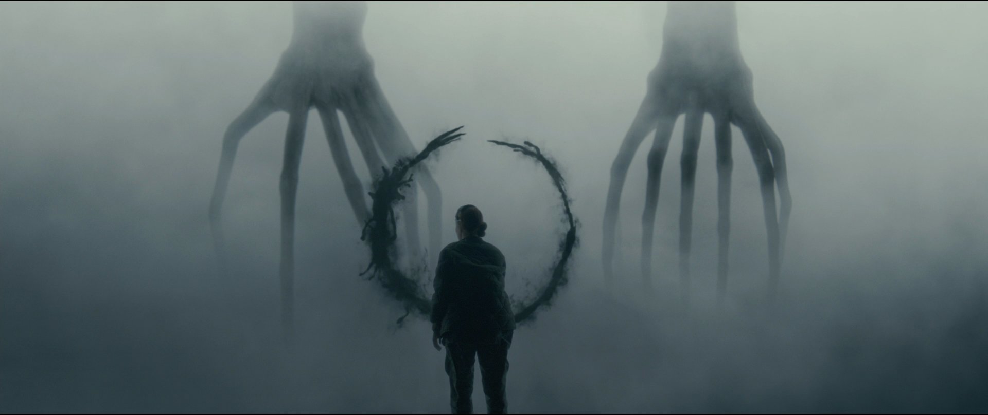
We can see in the color-blended image that colors fill in on spaces that are separated geographically from one another in the xy-plane of the image:
Compare this to another version I made, where I allowed x and y to be included:
We see that vertical line in the upper third of the shot forming due to the influence of x in the data. This also demonstrates overfitting: It’ll draw a line where two adjacent data points are functionally equivalent if you misspecify k. But for aesthetic purposes, overfitting isn’t necessarily a problem!
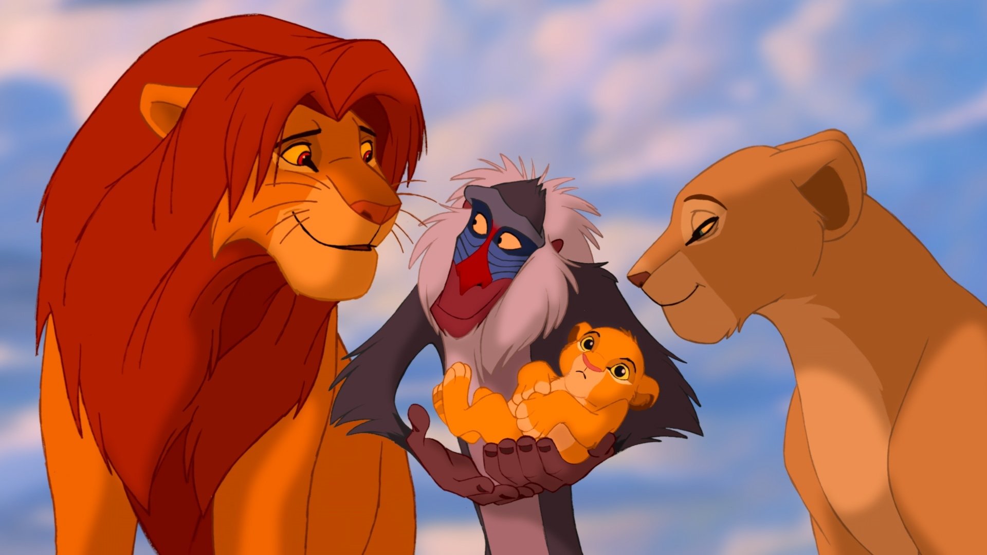
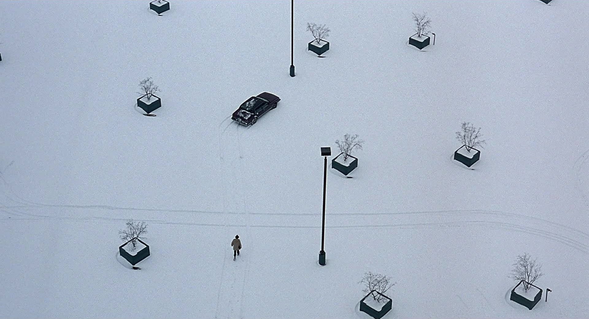
We also see a indistinct boundaries of one color into another here. The underlying image has few distinct lines—the entire image is ink drawn onto a wispy mist. What about when we get distinct lines and contrast? The easy answer for clean lines would have been to go to Wes Anderson here, but I felt like that was too expected from a blog post written by somebody such as myself. So instead, I took colors from the animated Lion King, a vibrant film, and projected it onto one of Roger Deakins’ best shots from Fargo.
set.seed(1839)

pal4 <- get_palette("lionking.jpeg", k = 2, mdn = TRUE)
plot4 <- make_plot("fargo.jpeg", pal = rev(pal4), xy = FALSE)

ggsave(
  "fargo_k2.png",
  plot4$plot,
  width = plot4$dims[1],
  height = plot4$dims[2],
  units = "px"
)
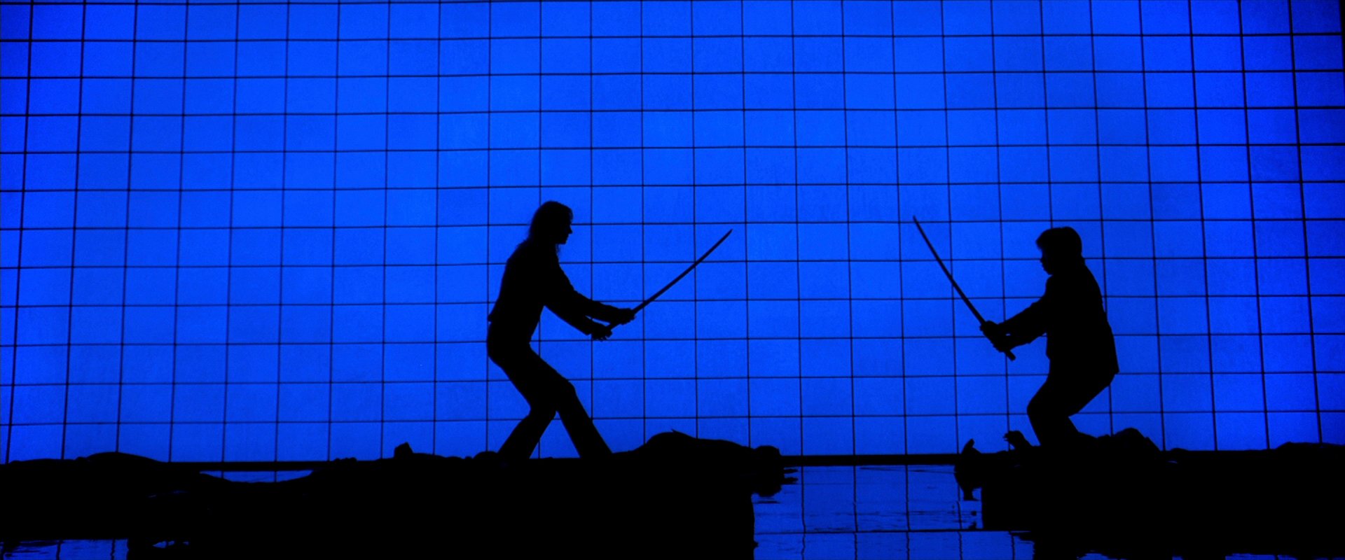
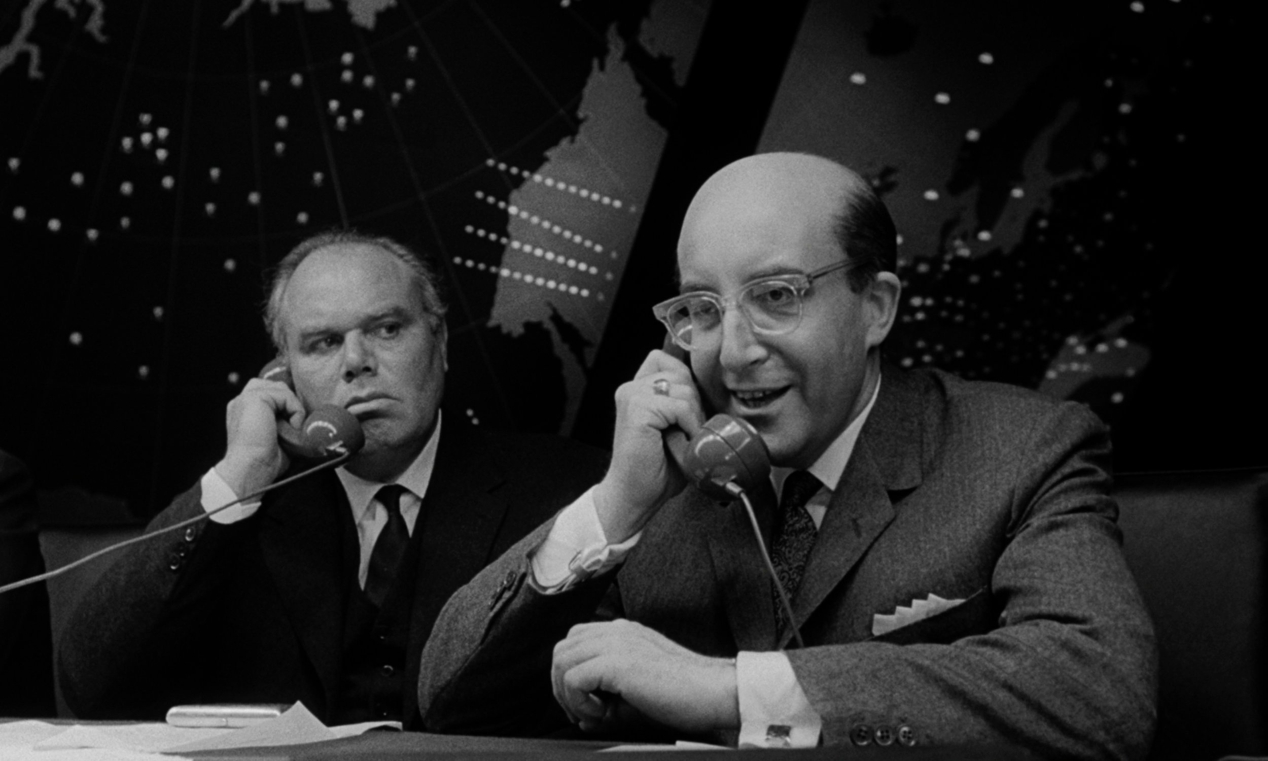
The last thing I wanted to do was look at a shot that had two primary colors and project it onto a black-and-white film, replacing that underlying dichotomy with two other colors.
set.seed(1839)

pal5 <- get_palette("killbill.jpeg", k = 2, mdn = TRUE)
plot5 <- make_plot("strangelove.jpeg", pal = pal5, xy = FALSE)

ggsave(
  "strangelove_k2.png",
  plot5$plot,
  width = plot5$dims[1],
  height = plot5$dims[2],
  units = "px"
)
The first shot below from Kill Bill Vol. 1 came to mind for a shot that was mostly two colors, while I went with my favorite scene from Dr. Strangelove, perhaps the funniest film ever made, for the black-and-white still:
The functions are above and the full code is at my GitHub. Try playing with the functions and blending images; it’s fun, but it also a visual guide that helps you truly understand what exactly k-means clustering is doing.


